
The Importance of UI/UX in the Lending Sector
“Design is not just what it looks like and feels like. Design is how it works.” – Steve Jobs
This is the visual age. What you see is what you get. In a world where the ubiquity of connected devices have permeated every aspect of customer decision making, visual appeal is what makes or breaks deals. In the financial lending industry, companies that focus on perfecting the visual appeal of their products are the ones that succeed.
Visual appeal has two sides to it: User Interface, or UI, and User Experience, or UX. As many confuse these terms and use them interchangeably, it helps to get clarity on them first. UI refers to any visual feature that the user interacts with on their digital screens, such as buttons, scrollbars, and text input fields. The success of UI hinges on how fluid the back end of an application orchestrates a user’s inputs as smooth as a symphony. One click and it should be done sans any hiccups.
User Experience is a term that followed the invention of User Interface. Jason Ogle, Host and producer of User Defenders podcast, Designer at NCM says, “User Interface is the bridge that gets you where you want to go, while User Experience is the feeling you get when you get there (or don’t!). Thanks to the evolution of easy graphical user interfaces, it now becomes possible for users to rate their comfort of use on an easy scale to provide the developers with instant feedback.
UI/UX in the financial world
Modern banks had to switch from a product-centered thought process to an experience-centric one. Today, users don’t just need a working product, but also a smooth and positively reinforcing experience that makes them return every time. Here are four benefits of having a great UI/UX for a bank:
Building customer trust:
To illustrate: BANK A BANK B
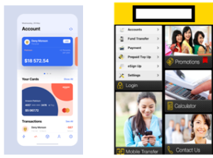
From the above two pictures, which bank do you think is more legitimate, judging based on the mobile application alone: Bank A, or Bank B? While Bank A seems to have a superior layout with pleasing designs and fonts, Bank B has a shabby layout with stretched-out pictures, archaic fonts, and a non-intuitive flow of visual elements. The winner is clearly Bank A. It now becomes obvious that any customer would rate Bank A higher on credibility than Bank B, which may appear as a scam site. Just by looking at their screens. Trust is usually formed on the first impression.
Easy communication:
A good UI is much beyond pretty colours and fonts. A good UI allows for easy flow of information. A visiting customer should be able to browse through menus with ease and instantly grasp what the business seeks to convey. ‘Discoverability’ is the ease with which a customer can get whatever information they need. When that happens with minimal effort, it draws them closer to the decision making process.
Making the final decision:
As said earlier, a great UI is one that nudges the customer to make the final decision. Whether it is to choose a product or opt for a service, the customer’s perception of how the bank understands their needs makes the cut. “How receptive is the bank of my needs? Have all my questions been answered?” are the decision makers.
Winning against stiff competition:
Today, the world is replete with banks that seem to offer the same range of products and services. Then, where comes the differentiation? How does the bank stand out? The answer is obvious, it is to adopt a smacking good UI through superior designs, pleasing visual layouts, and ease of access elements that will last longer in the minds of the customer. That is it. That is the differentiator that wins.
For the love of digital comforts:
Successful consumer businesses like Ola, Facebook, Google, and Zomato provide the utmost comfort in their digital experience, with intuitive modules and visually appealing colour schemes. Expectations from customers based on known patterns such as say, a gear button should lead to settings, are instantly rewarded in great UI design. Habit drives usage. Easy-to-use UIs in digital businesses lead to stickiness of use due to its enormous comfort, instantly driving profits. Whatever be the application, users want it all served on their platter, and good businesses cater just that.
Let’s take a leaf out of the book of UXDA’s Light Bank UI, an experimental interface that was nominated for some of the world’s most prestigious design awards. Let’s analyze the three top features that every good Banking UI should have:
Human, all too human:
Massimo Vignelli said, “Good design is a language”, and this holds true for User Design as well. Right from the get go, when the customer browses through information on loans or savings accounts to making payments or filing applications, customers expect the app to talk to them just as a human would. The UX should therefore be a veritable replacement for the actual teller or the manager at a physical bank. Anything less wouldn’t work in today’s world where customers have, and expect least to no interaction with the bank directly, especially the millennials and those younger.
Keep it simple, please:
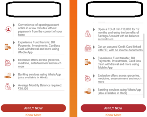
Banking information is generally very complex for the average person. Presenting it all in a simple, palatable manner is crucial for a bank’s success. This is one of the main reasons why the banking industry took so long to make the digital move: communicating complex information becomes very tricky when there isn’t face-to-face communication. A good UI that presents information in a simple yet efficient way solves this problem. Let us look at the following page from XYZ bank’s website about the types of bank accounts it offers:
Though the information architecture is simple, it manages to convey the most important points with efficiency. That is a successful UI/UX.
It is all in the mind:
Most top banks and financial services take the help of psychologists to develop great UI/UX. There are many, many psychological principles that apply to design. One example is the serial position effect, that says that we are psychologically more likely to remember objects that are at the beginning and at the end of a list. That is pages like home and account are positioned at the beginning and at the end. Psychology also comes into play when deciding the colours and fonts that best suit an interface. Certain colours incite very specific moods and feelings, and it is important to keep in mind the power of the subconscious mind that is so hardwired in all humans.